
How to format a romance novel for self-publishing
Here’s something most readers never consciously notice: the formatting. And that’s exactly the point. When you know how to format a romance novel and you get it right, the pages sort of disappear. The reader stops seeing fonts and margins and scene breaks and sinks into the story instead. The formatting has done its job precisely because it’s invisible.
When it’s not done well, readers notice, and not always in ways they can name. Something feels off. The book feels less professional than the last one they read. A vague doubt creeps in about whether the author knows what they’re doing, and that doubt colours everything that follows, including the review they leave at the end.
Professional formatting is quiet marketing. It’s the signal, sent on every single page, that you respect your reader’s time and attention enough to get this right. This lesson is about understanding what “right” actually looks like for romance novel formatting, and making the decisions you need to make before you sit down to format or hand your manuscript to someone who will.
Decide your formats before you touch any tools
The first decision isn’t a design decision. It’s a publishing strategy decision: which formats will this book exist in?
Ebook is the baseline for almost every indie romance author, and for good reason. Digital sales dominate the romance market, and ebook formatting for self-published authors is the most straightforward place to start. But paperback is worth serious consideration, not just because some readers strongly prefer print, but because a paperback gives your book a physical presence in the world. It shows up in shelfies. It gets gifted. It can be ordered through Ingram by libraries and independent bookstores in ways an ebook simply can’t.
Beyond ebook and paperback, your options expand to hardcover, large print, and special editions with premium touches like sprayed edges or alternate covers. Each additional format increases your upfront workload and costs: more ISBNs, more files to prepare and maintain, more proofs to order. Each one also increases your perceived professionalism and, in some cases, opens distribution channels you wouldn’t otherwise have access to.
The right starting lineup is the one that matches your readers and your resources. Look at what your bestselling comp authors are doing: ebook only, ebook plus paperback at launch, large print added later? Let that inform your decision rather than making it in the abstract. You’re not committing to every possible version on day one. You’re picking a sane starting point you can execute well.
Choose your tools thoughtfully
Your goal is professional-looking interiors without learning software built for design professionals. For most romance novels, that’s entirely achievable with tools designed specifically for book interior formatting.
The two options most indie romance authors settle on are Vellum (Mac-only, produces beautiful results with relatively little effort. And you can try it before you buy with my link above) and Atticus (cross-platform, handles both ebook and print from a single interface, and at $147 is the more budget-friendly option). Both include book-safe fonts, both have templates that suit romance novel formatting, and both have enough of a user community that you can find answers to most questions without much hunting. Kindle Create is a free option worth knowing about for ebook formatting for self-published authors who are only producing a digital edition, though it has real limitations for print.
In early 2026, a new design software has been making waves. It was created by Canva and is totally free. It’s called Affinity and one formatter I know, Sarah Neeson, has been using it enough to know that once her InDesign subscription expires she won’t be renewing since Affinity is doing everything she needs it to for her own books and her clients’.
One thing worth knowing before you choose: if you plan to publish more than one romance novel (and the assumption here is that you do), invest in software that handles both ebook and print from the outset. The free or ebook-only options will save you money once and cost you time repeatedly. Give yourself a learning window before your upload deadline too. Formatting software has a modest learning curve, and you don’t want to meet it the night before you planned to publish.
Print decisions: trim size and page count
For your paperback romance novel formatting, you’ll need to choose a trim size: the physical dimensions of the finished book. This affects how your book looks on a shelf, how it feels in a reader’s hands, and how your page count lands at a given word count.
The most common trim sizes for romance are 5 x 8, 5.25 x 8, and 5.5 x 8.5. Shorter books tend to look better at smaller trim sizes, where the spine has enough width to carry your title and author name legibly. Longer books have more flexibility, and a slightly larger trim can keep a 100,000-word novel from becoming unwieldy.
The practical move before you finalise your trim size is to check your comp authors’ paperbacks. Hold one if you can, or look at the dimensions listed on their Amazon page. You want your book to feel like it belongs in the same physical space as the books your readers already own. When you format a romance novel for self-publishing in print, this kind of hands-on research is worth more than any spec sheet.
Style your interior
Interior styling covers your body font, chapter headings, scene breaks, margins, line spacing, headers and footers, page numbers, and any embellishments like drop caps or ornamental dividers. These decisions work together to create the reading experience your pages deliver, and they should feel like a natural fit for your sub-genre and tone. This is where romance novel formatting tips move from technical into intentional.
For body text in print, serif fonts are the traditional choice because the small strokes at the ends of letterforms help the eye track across a line of text. Options like Garamond, Crimson Pro, EB Garamond, and Baskerville-style fonts are all readable and familiar to romance readers without calling attention to themselves. For ebook formatting for self-published authors, both serif and clean sans-serif can work well. What matters most is clarity at different screen sizes and on different devices.
One thing worth checking regardless of which fonts you use: licensing.
Many fonts that appear in design tools are free for personal use but not for commercial publication. Formatting software like Atticus and Vellum include fonts that are cleared for book use. If you bring in anything additional, verify the license before you publish.
Headers, footers, and page numbers seem like minor details until you see them done inconsistently across a series and realise how much quiet credibility that inconsistency costs. Decide where your book title, author name, and page numbers will sit, and build those decisions into your formatting template so they carry through automatically. The convention is to omit headers and footers from the title page, copyright page, and chapter opening pages. Consistency everywhere else is non-negotiable.
Embellishments (drop caps at chapter openings, ornamental scene dividers, illustrated chapter headers r even full pages) can add real polish when they fit the tone of the book. A cozy small-town romance might carry a tiny floral divider beautifully. A dark romance probably doesn’t. The guiding principle is that every decorative choice should feel like it belongs in this specific book, not like it was borrowed from a template without thinking.
The case for an elevated table of contents
Most fiction authors treat the table of contents as a formality: Chapter One, Chapter Two, Chapter Three, all the way to the end. Technically correct. Completely forgettable.
There’s another approach, and romance readers love it.
An elevated table of contents gives every chapter a title instead of (or in addition to) a number, and those titles do actual work. They can tease what’s coming without spoiling it, set the emotional tone of a scene before a reader gets there, wink at a trope, or carry a thematic thread through the whole book. Done well, a table of contents becomes part of the reading experience rather than a navigation tool the reader skips past.
This matters more than it used to, because ebook tables of contents are now interactive. Readers browse them before they buy. A reader skimming the sample of your book on Amazon can click into your table of contents and read every chapter title before she’s committed a penny. If those titles are intriguing, funny, romantic, or tonally on-point for your sub-genre, they’re doing pre-sale marketing work for you.
Two examples of this done well
In my book, The Billionaire’s Shrubbery, every chapter title names the POV character and then delivers a plant-forward pun (for the heroine) or pop culture riff (for the hero) that signals the emotional tone before the reader reads a single word.
Virginia — Bonsai Bonanza.
Will — Sleepless in Seattle and L.A. and Vancouver.
Virginia — Angel Wings Meet the Devil.
Will — The Beard and the Beautiful.
A reader browsing the table of contents gets the dual POV structure immediately, picks up the book’s light, punny tone, and gets a teaser of each scene’s energy, all before Chapter One. That’s a lot of work for a few words.
A different approach shows up in Defy the Stars by Daphne Pond, a contemporary Romeo and Juliet reimagining that uses quotes from the play as chapter titles:
Enter Juliet,
Two Households,
Both Alike in Dignity,
Mad Blood Stirring,
I Defy You Stars.
Every title pulls double duty. It signals the emotional register of the chapter while reinforcing the thematic throughline of the whole book. A reader browsing the table of contents before buying gets the tone, the literary sensibility, and a taste of what kind of romance this is, all before Chapter One.
Two different books, two different approaches, one shared result: a table of contents that engages a reader right off teh hop which (we hope) will make them more likely to buy.
How to do this in your formatting software
In both Vellum and Atticus, adding chapter titles is straightforward. Instead of labelling your chapters numerically only, you add a subtitle or title field to each chapter heading.
Vellum calls this the “Chapter Subtitle” field. It’s a two-step process.
Step 1:
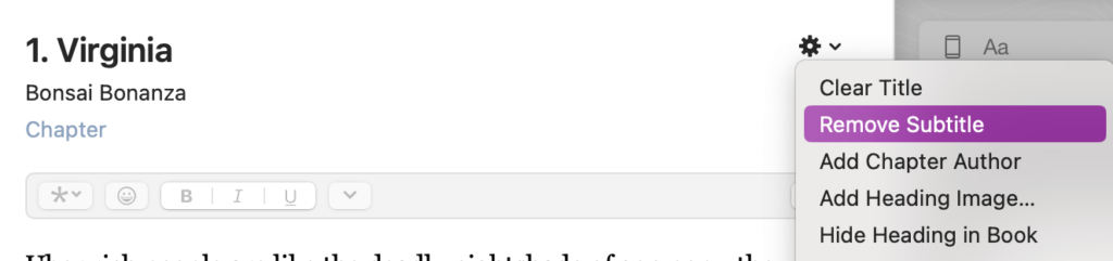
In Vellum, click the gear icon on any chapter heading to add or remove a subtitle. That subtitle becomes your chapter title in the table of contents. Since I already have subtitles, mine says Remove Subtitle. When you use it it will say Add Subtitle. You need to do this for each chapter.
Step 2:
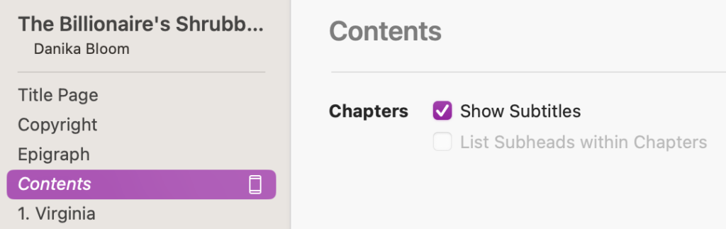
To make chapter subtitles appear in your ebook’s linked table of contents, select the Contents section and check “Show Subtitles” in the settings panel. You only need to do this once.
Atticus handles it through the chapter title settings in your style panel. I don’t use Atticus so I don’t have screenshots. Sorry.
Both will pull those titles into your linked table of contents automatically, so the clickable TOC your ebook reader sees reflects your full chapter titles, not just numbers.
For print, chapter titles appear on the chapter opening page, and your formatting software will carry them into the print TOC if you include one. Not all print romance novels include a TOC, but if yours does, elevated chapter titles make it worth including.
One practical note: if you’re going to use chapter titles, commit to them for the whole book. A table of contents that switches from evocative titles to “Chapter Fourteen” halfway through reads as unfinished, and readers will notice.
Front and back matter
You mapped out your metadata in Lesson 5.1. Now that metadata needs to be built into the formatted book itself, and the ebook and print versions handle it differently. This is one of the most practically important romance novel formatting tips, because the decisions you make here directly affect how readers experience (and act on) your back matter.
For print, front matter typically includes the title page, copyright page, and dedication if you have one. An epigraph, a content note, or a brief “also by” list can also live here. Print readers expect to flip through a few pages before the story starts, and there’s no penalty for it.
For ebook formatting, front matter is a different calculation entirely. Everything before Chapter One counts against your Read Sample preview percentage: the portion of your book Amazon shows to browsers who haven’t bought yet. Keep your ebook front matter lean. Title page, copyright, and dedication if you have one. Move your acknowledgements, your full “also by” list, and anything non-essential to the back. You want a browser’s preview to spend as much time as possible in Chapter One, not in your copyright notice.
Back matter is where some of the most valuable reader relationship work happens, and it’s where a lot of indie authors leave real opportunity on the table. The moment right after a reader finishes your book (when she’s emotionally satisfied and primed to want more) is the single best moment to ask for the next thing. The most strategic call to action is to get her to sign up for your email list to get a bonus epilogue. Alternately, you could have her click through to the first chapter of the next book in the series, or follow you somewhere she’ll see you regularly. Every page after “The End” should either deepen the relationship or guide her toward the next book. If a page is doing neither, it probably doesn’t need to be there.
Proof and test before you upload
Formatted files need to be tested before they go live, and testing means actually reading them in the format a reader will experience, not just scrolling through the source file looking for obvious errors. This step applies whether you’re handling the book interior formatting yourself or working with a professional.
For your ebook, load the file onto at least one reading app and, if possible, more than one device. Check that the table of contents jumps to the right places, that scene breaks appear correctly at different screen sizes, and that every link in your back matter actually works. Broken links in back matter are one of the most common and most costly formatting errors indie authors make, because they’re invisible in the source file and only reveal themselves when a reader tries to click through.
For your paperback, always order a physical proof before you publish. Looking at a print-ready PDF on screen is not the same as holding the finished book. You’re checking that your inner margins are wide enough that text doesn’t disappear into the spine, that chapter openings and headers behave correctly throughout, and that the overall print quality is what you expected. Different print-on-demand machines have different tolerances, and a setting that looks correct in your file can translate slightly differently in the finished product. The proof is your last chance to catch that before your readers do.
What you’re deciding in this lesson
By the time you finish this lesson (and the accompanying worksheet if you’re in the Author Ever After community), you won’t have a formatted book. What you’ll have is every decision made so that formatting a romance novel for self-publishing (whether you do it yourself or hand it to someone else) is a focused execution rather than an ongoing series of choices made under pressure.
That’s the difference between book interior formatting that gets done once, cleanly, and formatting that gets done three times with two extra upload rounds and a proof you’re not quite happy with.
Key takeaway
Formatting decisions feel like a secondary concern right up until a reader leaves a review saying something felt “off” and you realise the issue wasn’t your story, it was your pages. Knowing how to format a romance novel for self-publishing means making every decision before you open the software: your formats, your tools, your trim size, your interior style choices, your front and back matter plan. Vellum vs Atticus vs Affinity, serif vs sans-serif, ebook front matter vs print front matter. These are all answerable questions once you know what you’re deciding and why. Make those decisions early, and the formatting itself becomes a straightforward execution rather than a stressful guessing game.
Join Author Ever After
You’ll get immediate and full access to the Romance Your Launch program (all 11 modules), a worksheet for every lesson, plus three weekly, small group support meetings to answer all your questions, and a freaking amazing community of pre-published and early career romance authors who are building their indie publishing careers alongside you.
Get more details about the community here.
Or, go straight to the application form.
Get every lesson in the Romance Your Launch course
—> Click this link and I’ll send you two to three lessons a week, starting with Lesson 1.
—>Or, join my regular email list if you’d rather just pick up from the current lesson.
This lesson is part of Module 5: Publish-ready romance in the Romance Your Launch program.
5.6 Book cover file specs for self-publishing authors
Book cover file specs for self-publishing authors Your cover designer has delivered your files. They're beautiful. You love them. You're ready to upload and get this book into the world. Understanding book cover file specs for self-publishing is the one thing standing...
5.5 Formatting check before you publish your romance novel
Your cover is beautiful. But a stunning cover file that fails a platform’s technical requirements can mean reprints, rejected uploads, or colours that shift dramatically between screen and print. Here’s how to get your book cover file specs right before anything goes live.
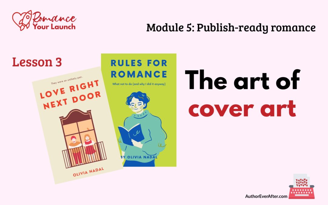
5.3 Romance book cover design guide for indie authors
Your feelings about what looks beautiful are almost beside the point. A romance cover is a signal, not self-expression. This romance book cover design guide shows you exactly what that signal needs to say and how to say it.

5.2 ISBNs for self-published authors: what you need to know
Before you upload your manuscript anywhere, you need to make one decision that affects every version of your book and every platform it lives on. Here’s what to know about ISBNs for self-published authors before you hit publish.

5.1 Romance novel metadata tips for self-published authors
Your book deserves to be found. But even a great romance novel stays invisible if your metadata isn’t doing its job. These romance novel metadata tips for self-published authors will help you get it right before you hit publish.
4.6 Final manuscript review before publishing your romance
“Almost there” is where a lot of authors stall out. In this lesson, you’ll walk through a final manuscript review before publishing so you can read like a reader, catch small issues that break immersion, and finally feel confident calling your romance done.

4.5 Line edit for a romance novel that feels polished
The line edit is where your romance stops feeling like a draft and starts feeling like a book. In this lesson, you’ll learn how to make your sentences clearer, sharper, and more intentional—without turning your voice into bland, beige prose.
4.4 Scene level edit for a romance novel that hits harder
Scene level edit for a romance novel that readers actually feel The structural edit asked whether your story works; the scene level edit for a romance novel asks whether your story feels. You've fixed the bones: the romance arc is present, the beats are in the right...

4.3 Structural edit for a romance novel that actually works
A structural edit is where you stop fussing over sentences and zoom all the way out to your romance as a whole. In this lesson, you’ll learn how to read your draft for structure, map the romance arc, and spot the big changes that will make everything you revise next actually worth the effort.

4.2 Beta readers for romance authors who want better books
Before you sink weeks into polishing sentences, you need to know if the story actually works for anyone who isn’t you. In this lesson, you’ll learn how to find and brief beta readers for romance authors so you get targeted, story-level feedback that makes revision easier instead of overwhelming.
4.1 Self-editing tips for romance authors who want readers
Self-editing is not a punishment for an imperfect draft; it’s how you give your romance a second life with a clearer head and a sharper eye. In this lesson, you’ll set yourself up with mindset, tools, and support so your edits actually help you reach more readers.
3.5 Social media strategy for romance authors
You do not need to be everywhere online to sell romance. In this lesson, you’ll choose one platform, decide what you actually want social media to do for your career, and build a sustainable posting rhythm that turns curiosity into clicks on your lead magnet.
3.4 Simple romance author websites
Your author website doesn’t have to impress anyone. It has to exist and give readers one clear place to go. In this lesson, you’ll pick an easy platform, claim your URL, write your copy, and build a simple, on‑brand home that points straight to your books and your list.
3.3 Email list setup for romance authors
Followers belong to the platform. Your list belongs to you. In this lesson, you’ll connect your lead magnet to a clean email setup and draft a four‑email welcome sequence so every new romance reader is welcomed, warmed up, and ready when you launch your book.
3.2 Romance lead magnet ideas to grow your email list
Your lead magnet is not a throwaway freebie. It is often the first story a new reader ever sees from you. In this lesson, you’ll choose the right format, length, and emotional promise for your romance lead magnet so it attracts the readers who will go on to buy your books.
Need to go back to a previous lesson?
Return to Module 5: Publish-ready romance to see all six lessons.
Or go back to the Romance Your Launch home page to see all the modules and links to their hub pages.
Want the next lesson in your inbox?
This post is part of the Romance Your Launch series—a lesson-by-lesson guide to self-publishing your romance novel, written for pre-published and early career romance authors.
.
—> Click this link, drop in your name and email address, and I’ll send you two to three lessons a week, starting with Lesson 1.
.
—> If you’d rather just pick up where the series is, join my regular email list from this link.